
Tuesday, December 13, 2016
Oil Pastel Painting
This is the picture of my oil pastel painting. My goal is to show the reflection on the smooth surface of the object. For example, the lipstick tube in drawing is supposed to be silver. But since I put all of stuff on a green board, it just turned into green. Also, because the ball is next to the lipstick, it reflects part of the ball as well. I accomplished it by drawing a small one on the sketch book and then copy it to the paper. What surprised me the most is the cover of the lipstick in my drawing, which is made of plastic and is translucent. It cuts the shadow of lipstick in many pieces, and adds some different colors for the shadow of the ball too. The existence of the cover really makes the painting look good! My drawing is about shadow, reflection, and highlight. The most difficult challenge is to draw the ball. I spent a whole class finishing it. First I just gave the ball a color of red and yellow, and then I found a line on the ball which is the darkest part of it. After that I just made some transition between dark and light, so the picture wont look too conspicuous. In the end, I found the lightest part and added a small highlight there on the ball. I think my drawing really works on the reflection. In this drawing, I learned that the original color of an object can be influenced by the surrounding stuff. In our class I feel Josh really did a good job. He showed the texture of lipsticks and the shadow of the ball successfully. Also, I like the color he chose. It made a good contrast with his background. If I could have a do-over, I will try to make my drawing clean on the blank space. I feel best about the shadow and the reflection of my work.

Saturday, December 3, 2016
Mentor Pages


This is my work of two-page oil pastel. I chose Peggi Kroll again as my mentor. Firstly I picked a painting of her, and then zoomed in to find a specific area to draw. I chose the spoon and part of the tea pot. I drew them in black and white by pencil on the left page, and it was about credit card size. Then I drew a whole page oil pastel one on the right page. I chose Peggi Kroll because I like the way she uses color in her paintings. For example, she put a little red on the handle of the green tea pot. It is the reflection of the red tea cup around it. She made a contrast, which helped add attraction for the picture, by doing this. I like her painting also because the colors she uses are all in a harmony with each other. This makes the picture look very comfortable.
Sunday, November 27, 2016


Sunday, November 20, 2016
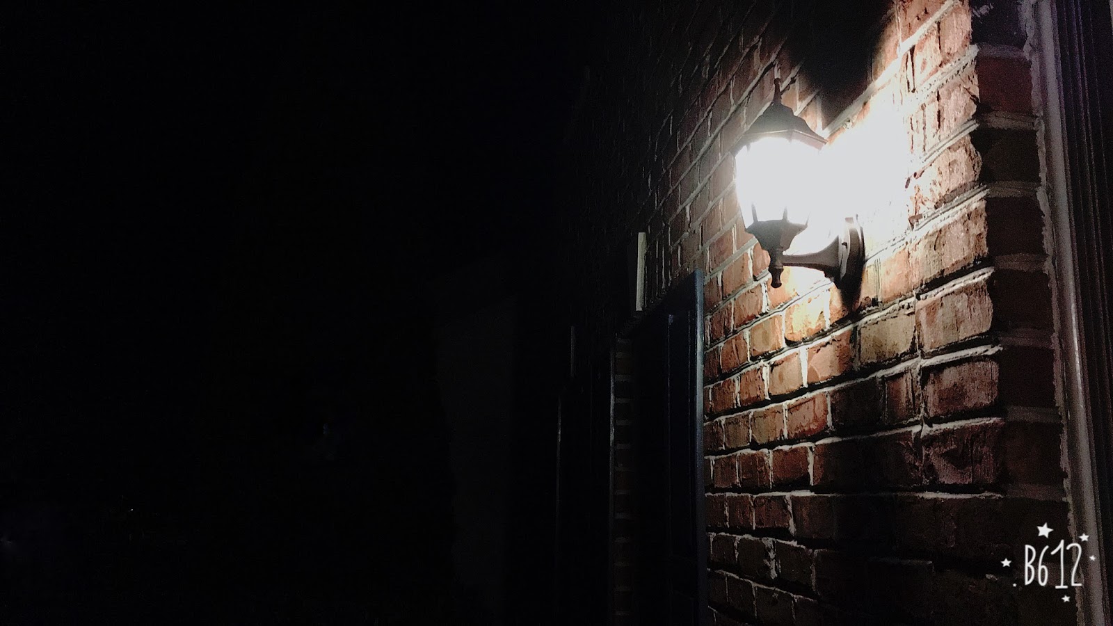
Light in the Night

I took the picture in the late night. It's one of our jpg challenge photos of "Into the Night" and it's about a light near garage. I chose this one because it looked really beautiful in black and white. When I turned it in charcoal, we can see the light is the brightest part and it made a small part of the wall behind it bright too. But rest of the parts are really dark, you cannot even see the details. Therefore, the drawing formed a big contrast, and people will be easily engaged by the light, which is the center and the name of the drawing.
Tuesday, November 8, 2016
Carry-out carton and chopsticks
For this work, my goal is to draw people's attention to the carry-out box through chopsticks. I accomplished it by giving a specific location to chopsticks. I made the chopsticks lean on the box vertically, which can lead your eyes from the bottom of the picture to the center(carton) since the chopsticks are thin and long. My painting is about the light and the shadow and the composition. The most difficult challenge for me was to draw the shadow on the box. I met the challenge by drawing it step by step. I drew each part of the box slowly and kept making modifications to make it look better. I feel my drawing really works to show the shadow and light, since the box is really three-dimensional which looks like a real one not just a picture. From this work I learned about shadows. I learned from Nancy about the values, because she made them really clear and contrast to each other. The shadow of box is really dark, the floor is light, and the chopstick is kind of in the middle. In my class Jessica's painting is really impressive to me. Her chopsticks in the drawing attract people's attention successfully. I think there are mainly two reasons: first is that the chopsticks are so long that have reached the bottom of the picture, and second is that her chopsticks contrast to the background greatly. I learned from her about the composition and the value. If I had a do-over I would use charcoal to draw it again. I feel best about the shadow in my drawing.


Monday, November 7, 2016
Pretend its yours
I pretend Carol's work was mine. In the work my goal is to show the shadow of the pumpkins and make the drawing look as real as possible. I accomplished it by making the shadow really dark, which contrasts to the surrounding and help the picture look really three-dimensional. My painting is about shadows, composition, and backlighting. Backlighting lets me be able to show values very well , and the good composition makes my pumpkin really attractive. The most difficult challenge for me was to draw the values on the pumpkin. Since the values are really complicated, firstly I observed the pumpkin carefully, and then erased some parts hard to make the highlight and some parts comparatively lightly to make the transition. I feel my drawing really works to show the shadow and value. From this work I learned about shadows. And I found that if I left a big white part which contrasts to the dark shadow, it really helps show the reality of the drawing. If I had a do-over I would make the outline of the pumpkin vines more clear. I feel best about the shadow and the composition in my drawing.

Sunday, October 30, 2016
Mug and Pearl Necklace
In this drawing I drew a mug and a pearl necklace within it. My goal is to show the shadow and the reflection on the surface of cup. I accomplished it by observing carefully and using different pencils to draw it. What surprises me most is how beautiful the surface looks after finishing it. My painting is about shading and shadows. The most difficult challenge for me was to draw the surface of mug, because it was so smooth that can reflect the surrounding objects. I faced the challenge by observing really carefully and using distinct values. I feel my drawing really works to show the shadow and values. From this work I learned about how to make the drawing as realistic as possible by using light and shadows. In our class Carol made a good composition in her work, and I learnt from her that a good composition really can help create a much more attractive work. If I had a do-over I would make the shadow darker so people can easily differentiate it from mug itself. I feel best about the values in my drawing.


Monday, October 24, 2016


Tuesday, October 18, 2016
Pumpkins
In the this work I drew one big pumpkin and one small pumpkin. My goal is to show the light and shadow. I accomplished it by using charcoal, eraser and tissue. My painting is about the composition of pumpkins and backlighting. Composition makes my drawing look harmonious, and backlighting lets me be able to show values very well. The most difficult challenge for me was to draw the shadow. My drawing has a lot of different shadows, such as the shadow of the branch, and the shadows of two pumpkins. These shadows overlap each other, therefore, some parts look darker while other parts are really light. Firstly I made all the drawing dark and then I used tissue to wipe the part which supposed to be light, and finally used white chalk and eraser for highlights. I feel my drawing really works to show the shadow. From this work I learned about composition. A good composition can really make the work different. The biggest surprise to me is that I can do a drawing by charcoals. In my class Angela's painting is really impressive. She made really good highlights. I learned from her how to blend up the highlight with its surrounding and make it not too stand out. If I had a do-over I would choose to draw it directly according to the objects instead of the picture. I feel best about the shadows in my drawing.


Sunday, October 9, 2016
Things I obsess about
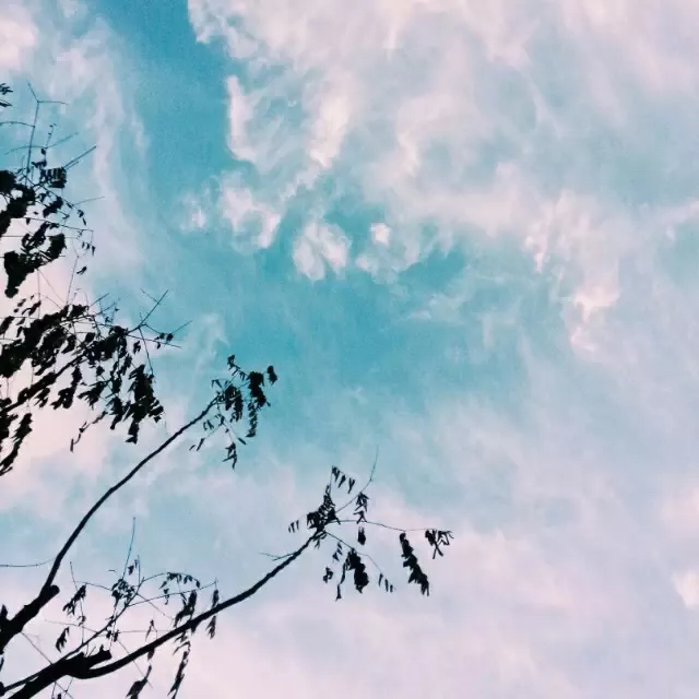
I obsess over the sky. It has different colors at the different time, but all of them are beautiful.


I obsess about the snow. The snow can cover everything. It's white, pure and innocent. It makes the world clean.


I obsess about plush toys. They are soooo cute!!! I put them all over my room because they make me not feel alone.


Eleven in total!


I obsess about the snow. The snow can cover everything. It's white, pure and innocent. It makes the world clean.


I obsess about plush toys. They are soooo cute!!! I put them all over my room because they make me not feel alone.


Eleven in total!
Wednesday, October 5, 2016
Letter Sculpture
In the sculpture letter work, I chose the letter "lively" to draw. My goal is to use all kinds of techniques to make the drawing look as real as possible. I accomplished it by using shadow and light. When I drew them I used many different types of pencil, such as H, 2B, and 6B. Different pencil has different color, and also leaves a different texture on the painting, which makes the painting realistic. My painting is about backlighting and the textures of surface. Backlighting lets me be able to show values very well and the textures of surface makes my painting special, because every stroke is pretty clear in my work. You can recognize the value was drawn by many strokes instead of being wiped by tissue. The most difficult challenge for me was to compose letters. At first I tried to use hard paper but when I curved it it left crease on it which looked not good. Therefore, I changed to sketching paper and it works well. I used tape to fix them and them used glue gun to make sure all edges were connected. I feel my drawing really works to show the shadow and value, since the word seems to be the real letter sculpture. From this work I learned about shadows. I learned from Nancy about the values, because she made them really clear and contrast to each other, which helped the drawing look real. She's my mentor. In my class Josh's painting is really impressive to me. He used tissue to wipe the drawing and make it blurred. It still looked good. I learned from him that there are many ways to draw and you can find something to help you. If I had a do-over I would add some highlights on it. I feel best about "i", "v" and "y" in my drawing.


Sunday, October 2, 2016
My Family
Family photo that we took one year ago(that's the most recent one)

My younger brother(8 years old) It was taken last week when he was on the Great Wall

My dad, also on the Great Wall

My mom. I don't know where she was, but the picture was taken recently

A selfie of me

Two of my best friends, Sophia and Nancy. Sophia has transferred to Virginia, and Nancy will leave next year as well. This was taken last Halloween, but it's the newest photo for three of us.

The friends I met in America. It was taken on Christine and Diana's birthday. They are twins.

Sunday, September 25, 2016


Saturday, September 17, 2016


Thursday, September 8, 2016


Subscribe to:
Posts (Atom)